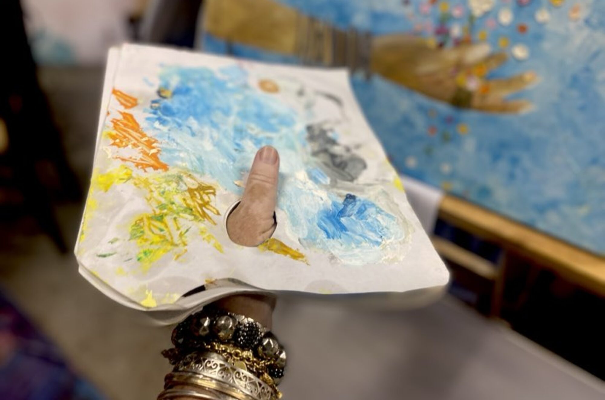
Since the Covid-19 slow-down, I’ve been setting these projects for our little Thursday Group of kids but thought I’d make them available for others also. I’d love if you wanted to send your kids work to be uploaded here!
These projects are based on the 7 (or 8) Elements of Art. One of our Thursday mums posted a great little clip about them which you can watch here. (Thanks Melanie!)
REMEMBER: you may need to take many pictures to just get one where everything works well!!!
Tone and value in art are kinda similar in that they are to do with intensity or impact. Tone is to do with black and white. Value is to do with colour.
Project 1 – TONE
This project will be in black and white.
Go outside with a phone or iPad to take pictures and look for at least 15-20 items of differing tone. Look for things like sticks and leaves from different spots in the garden. Some that fallen and dried, some fresh and green. Perhaps something burnt, or different shades from the autumn turning. Look for things that can line up beside each other CLOSE or touching. All the items in one picture.
Try to line them up from lightest to darkest. Some items will be a bit tricky and you’ll need to edit the photo transferring it to B/W to see and sometimes swap to get the tonal order right.
Make your image take up most of the screen space. Check focus, light, shadow – you don’t want the shadow of the corner of your phone in the picture!
Project 2 – ONE COLOUR and VALUE
Choose your favourite colour and find out what its opposite is on a colour wheel (google it).
Take photos of 9 different items in that colour. Make each item take up most of the screen in each photo.
Make the 9 photos into a collage and order the photos from least to most VALUE (strength of colour).
Do NOT make this one black and white!
You can do this inside or outside but do all 9 EITHER in or out and not a mixture as the light will be different and mess with your head.
I use free app “PIC COLLAGE” (or look in you phone App Store) to make collages but if you know a better one let me know! If you use this app select “free style” to get 9 photos all the same size.
Project 3 – many colours and VALUE.
Choose 9 objects of different colours but of similar size. Place them in ONE photo from lightest to darkest. Perhaps in a circle or grid or line – whatever seems pleasing to you.
Project 4 – LINE
Some of you will remember the Paul Klee inspired project we did a few years ago where you had to draw with your eyes shut… it was he that said “A line is a dot that went for a walk.”
This week please look for 4 things to photograph that STRONGLY suggest the theme of ‘line’.
Please vary what you photograph – not repeats of angles of the same thing.
So what sorts of things??? Maybe train tracks (old ones), power lines with birds on them, spider web lines, fork spokes… nothing soft… strong lines.
Please take the photos in colour – always be prepared to take a HEAP – you rarely get a great shot first time around, and choose the best.
Think about angles, how much of the frame you will take up, shadows not getting in the way, light etc.Make a collage of the 4 best different photos in colour AND a collage in black and white.
Play with the settings of each photo before making the collages to see if you can emphasise LINE by increasing contrast or changing the brightness.
Project 5 – TEXTURE
Find 12 items – indoors or outdoors, natural or manmade and and combinations of all that – in different textures.No rule on their colours – just represent as MANY different textures as you can ranging from smooth to fluffy to rough/coarse.
Present these as a STRIP collage so crop your texture images to fill the whole strip and place them in order from smoothest to least smooth. Play with the contrast etc to get the clearest images of their textures.
HINT – making sure your rougher images convey shadow will help show up the textures better than bright light alone.
Present this in colour AND B&W – consider whether you need to alter the contrast of each strip differently in the B&W to the colour. It’s doubtful that the B&W will show the textures as clearly as the colour since the brain already knows what it is seeing in a colour picture more so than a B&W.

Project 6 – COLOUR
Here is an 8 colour wheel. Find and photograph something as close as possible to each of the 8 colours on the wheel and place them around the edges of a 9 square collage leaving the centre square WHITE.
Try and photograph all natural items outside and ONLY revert to photos of man-made things if you seriously cannot find something natural in a certain colour.
Let this one take a few days and be on the lookout everywhere you go outdoors for each of these colours.Also – make each square close up or cropped enough to FILL the square with the colour in focus.
No background colours competing for attention.
When you present the collage – check you have your colours in the order they appear around the colour wheel.
More examples coming soon!


